Data Check-ins: We include a data-inspired check-in to start each of our TRKE virtual sessions. We aim for these check-ins to be useful for our cohort's shared learning but also hope our framing and the resources we share might be useful to other folks. We encourage you to look through this data-inspired check-in, explore the resources we use, engage with our prompts, and consider whether you'd be able to adapt this progression for your own context. Check out an example, below, to see if it might be for you, and explore our other posts with the “data check-in” tag to see other examples we’ve used.
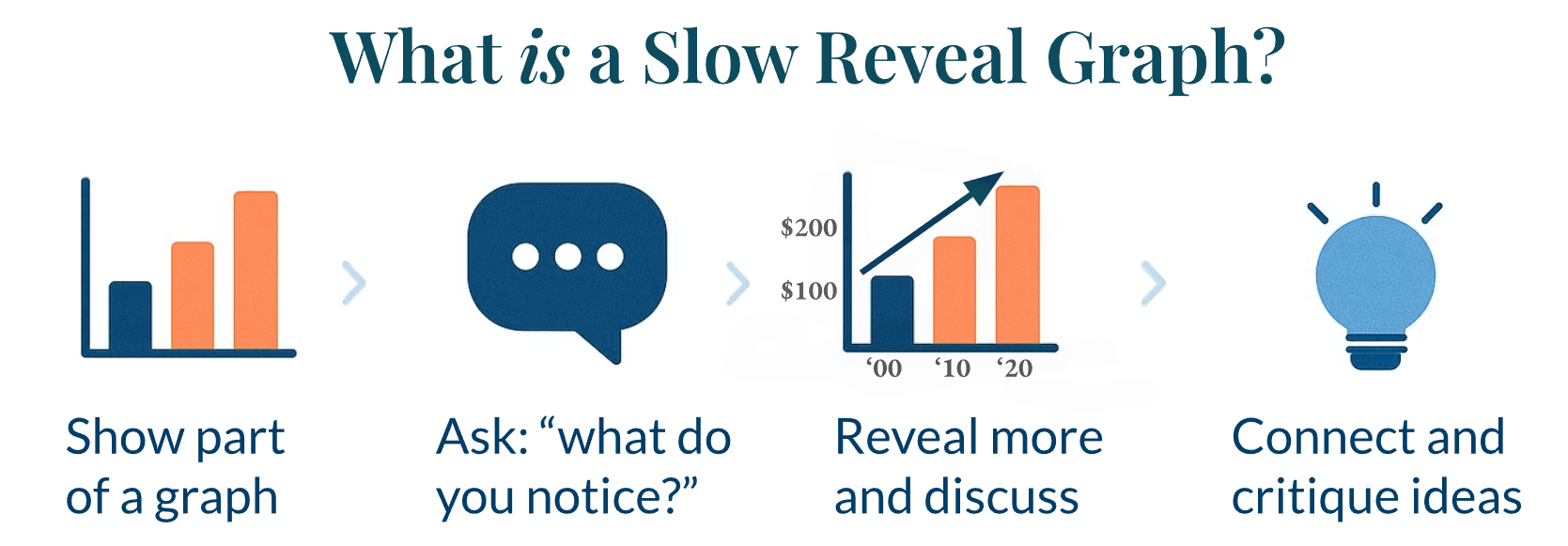
Facilitator Context: We designed this check-in to demonstrate how the slow reveal method can be used to help learners make sense of data visualizations. Instead of presenting a complete graph all at once, components are revealed in stages. At each stage, learners are invited to notice patterns, ask questions, and adjust their thinking and sensemaking.
During our October 14th, 2025 Virtual Session we had participants engage with a graph from the Annual Averages dashboard on WY-Adapt. The goal was to illustrate how slowly revealing components supports deeper inquiry.
Framing & Flow:
Reveal #1: Facilitators revealed a line graph showing only the x-axis label and several graph key items was displayed.
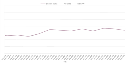
Facilitators allowed participants time to explore the graph and share answers to the following questions:
-
- "What do you notice about what you see here?"
- "What are you wondering?"
Participants shared their thoughts with the group.
Reveal #2: The P-value areas were added to the graph.
Participants were asked the following questions:
-
- "What new information did you just learn?"
- "How might that change what you are thinking?"
Participants shared their thoughts with the group.
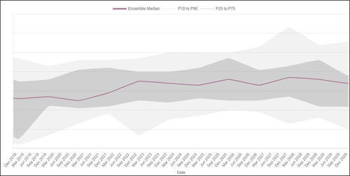
Reveal #3: The y-axis label and title showing the location were added to the graph.
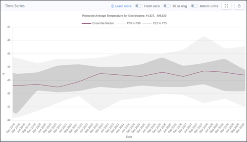
With this reveal, participants now knew what was being tracked and where the data was coming from. They were then asked the following question:
-
- "Based on these data, what do you predict average temperature will be in Seedskadee in 2050?"
Participants were asked to share their predictions with the group.
Reveal #4: Facilitators zoomed out on the graph to reveal that the portion participants had been viewing was a black box representing just one decade of temperature data within a much larger time scale.
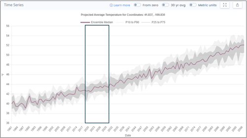
Facilitators briefly explained their reasoning for showing different time scales of the graph:
"We want to hone you in onto this idea of scale. So we started with a 10-year timescale, and now we have zoomed out to a much larger time scale with the same space and same modeled data."
Facilitators then placed participants into small groups to think about the following prompts:
-
- "Think about how scale is impacting the patterns that you might be seeing, or the claims that you might be willing to make, and why."
- "Think about how the slow reveal method impacted your thinking and sensemaking."
Following the small group discussion time, participants were asked to share some of their thoughts with the larger group.
A Data Check-in Skeleton: These are the general steps we include in all of our data check-ins.
- Consider a shared context and/or puzzling idea.
- Analyze/interpret a related dataset to explore trends, gather evidence, and test initial ideas.
- Reflect on what can be uncovered in these data, what new questions arise, and where you connect to ideas of uncertainty.
- Come together to share takeaways and connections to learners' own interests and contexts.
Reflect on How You Might Connect to these Ideas:
- How could you incorporate similar data exploration activities in your own context?
- What tools or ideas could help learners engage with real-world data?
- How might current research or researchers and interactive datasets enrich your teaching strategies?